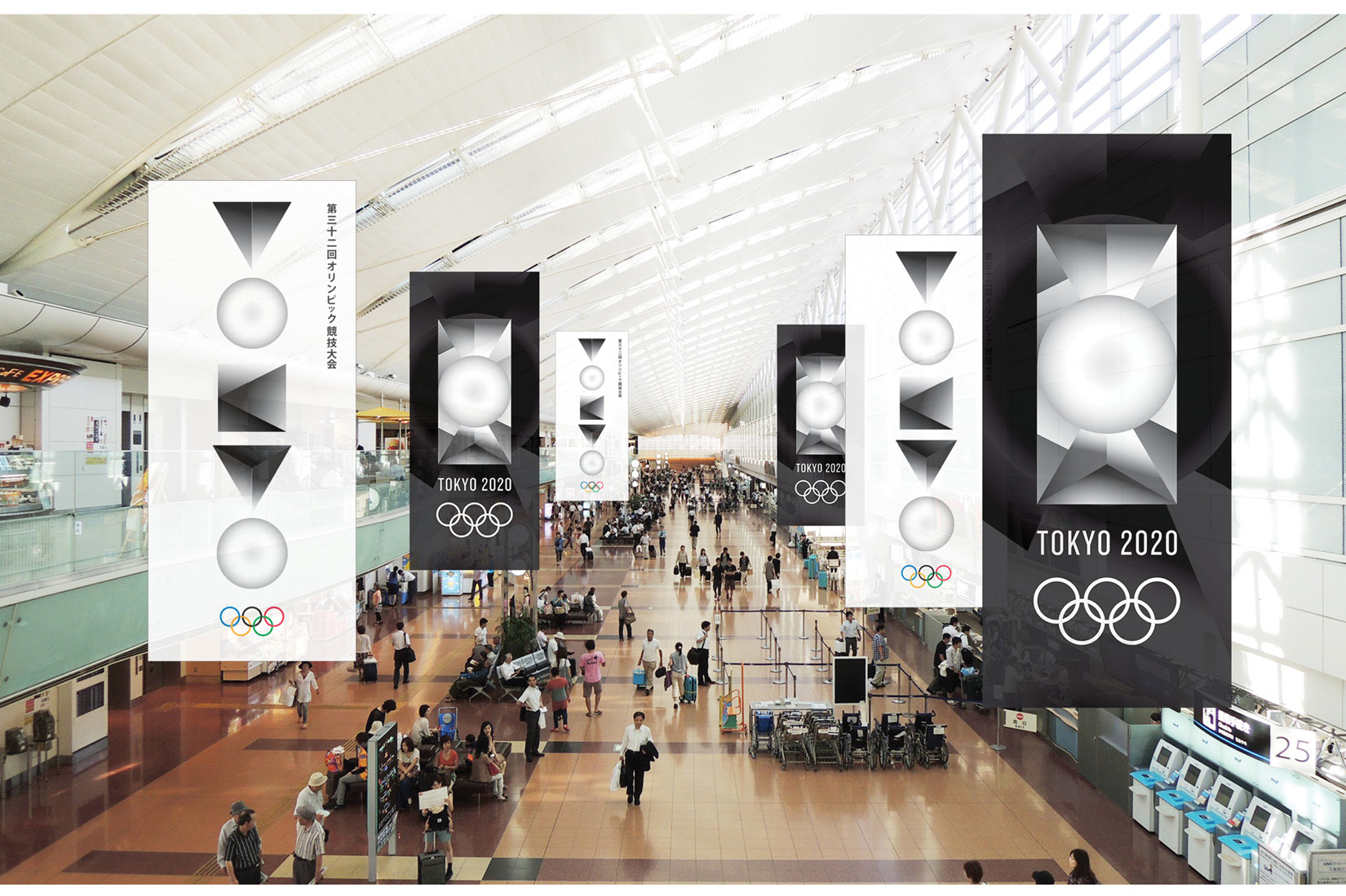
2020 Tokyo Olympic Emblem Submission
Back in 2015, the logo for the 2020 Tokyo Olympic was scrapped amid allegations of plagiarism. The redesign of the logo was carried out as an open submission from the public and I saw an opportunity to have some fun – so I went out an assembled a team of 4 (two art directors, a graphic designer and a fine artist) and let our creativity loose.
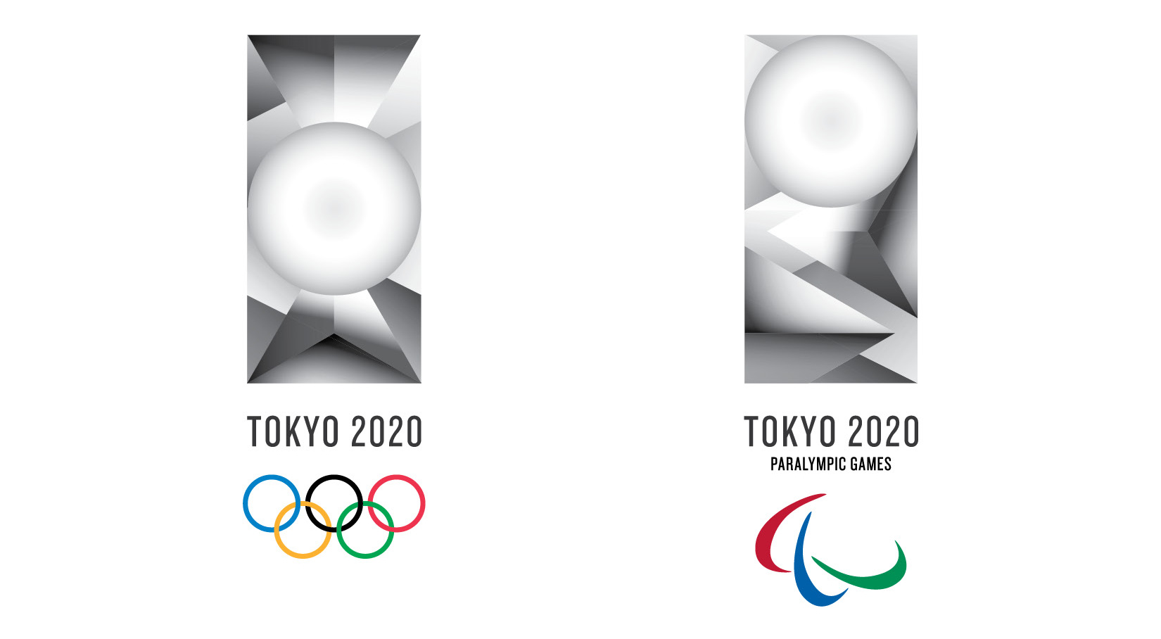
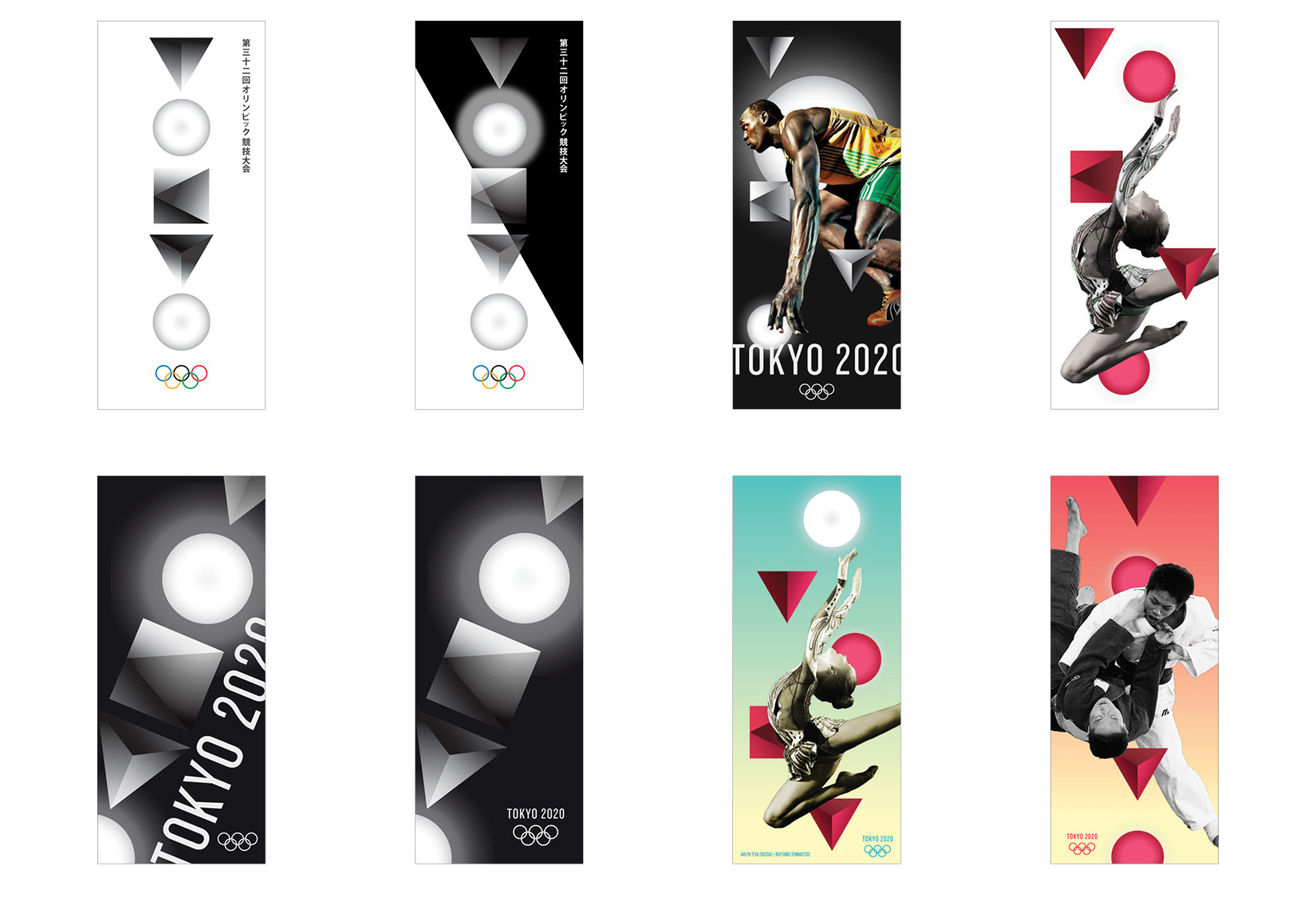
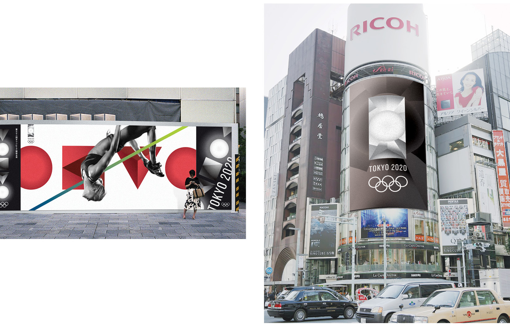
Our proposal for the Tokyo Olympics 2020 emblem symbolizes the beacon for the future, aspiration for personal best, and the inclusion of diversity. The glowing circle references Japan and the Sun, illuminating athletes and nations unified at the center stage. The logo portrays the Japanese spirit of monozukuri through the simple yet refined composition of forms.
The emblem embraces Olympics’ ability to bring nations together through the actualization of distinctive shapes
coming together to achieve one form.
